Checkbox复选框是一个可能每一个网站都在使用的HTML元素,但大多数人并不给它们设置样式,所以在绝大多数网站它们看起来是一样的。为什么不把你的网站中的Checkbox设置一个与众不同的样式,甚至可以让它看起来一点也不像复选框。
在本教程中,我们将创建5个不同的选择框,你可以在你的网站上使用它。
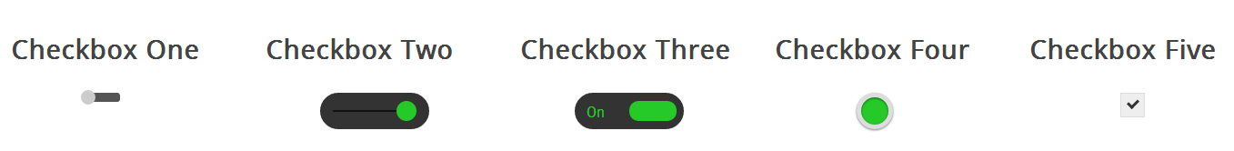
查看演示,可以看到我们将要创建的复选框样式。
首先,需要添加一段CSS隐藏所有的Checkbox复选框,下面我们会改变它的外观。要做到点需要添加一段代码到你的CSS文件中。
/** * 隐藏默认的checkbox */ input[type=checkbox] { visibility: hidden; } |
隐藏掉所有的Checkbox复选框后,我们需要添加一个label HTML元素,我们都知道,当点击的有for属性的label标签时,对应的Checkbox复选框会被选中。这意味着,我们可以通过label的点击事件来处理我们的Checkbox复选框。
样式一
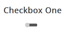
此复选框风格就像一个解锁滑块,滑块选中和未选中状态会显示在的不同位置。当单击滑块按钮(label标签),将会选中复选框,然后滑块移动到ON位置。
我们开始创建复选框区的HTML。
<section> <!-- Checbox One --> <h3>Checkbox One</h3> <div class="checkboxOne"> <input type="checkbox" value="1" id="checkboxOneInput" name="" /> <label for="checkboxOneInput"></label> </div> </section> |
因为这个样式的复选框,一个label不足以完成任务,我们用一个DIV元素包含checkbox,我们需要使用它们来做黑色条带和圆角。
/** * Create the slider bar */ .checkboxOne { width: 40px; height: 10px; background: #555; margin: 20px 80px; position: relative; border-radius: 3px; } |
现在,我们可以把label作为条带上的滑块,我们希望按钮效果是从条带的一侧移动到另一侧,我们可以添加label的过渡。
/** * Create the slider from the label */ .checkboxOne label { display: block; width: 16px; height: 16px; border-radius: 50%; -webkit-transition: all .5s ease; -moz-transition: all .5s ease; -o-transition: all .5s ease; -ms-transition: all .5s ease; transition: all .5s ease; cursor: pointer; position: absolute; top: -3px; left: -3px; background: #ccc; } |
现在这个滑块在选中(关闭)位置,当我们选中复选框,我们希望有一个反应发生,所以我们可以移动滑块到另一端。我们需要知道,判断复选框被选中,如果是则改变label元素的left属性。
/** * Move the slider in the correct position if the checkbox is clicked */ .checkboxOne input[type=checkbox]:checked + label { left: 27px; } |
这就是你需要的第一个Checkbox复选框的CSS。
样式二
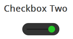
此复选框风格像样式一样,但不同的是,这个滑块按钮会改变颜色。当您单击滑块按钮,它移动到条带的另一边,并改变按钮的颜色。
HTML代码和样式一是完全一样的。
<section> <!-- Checbox Two --> <h3>Checkbox Two</h3> <div class="checkboxTwo"> <input type="checkbox" value="1" id="checkboxTwoInput" name="" /> <label for="checkboxTwoInput"></label> </div> </section> |
这个DIV会变成比样式一大一些的条带,label依然是作为滑块,使用下面的CSS来定义它。
/** * Checkbox Two */ .checkboxTwo { width: 120px; height: 40px; background: #333; margin: 20px 60px; border-radius: 50px; position: relative; } |
这个样式中间有一个黑色的条,滑块会沿着它左右滑动,但是DIV元素已经使用了,所以我们需要用:before伪类创建一个新的元素。
/** * Create the line for the circle to move across */ .checkboxTwo:before { content: ''; position: absolute; top: 19px; left: 14px; height: 2px; width: 90px; background: #111; } |
和样式一一样,接下来我们为label写CSS样式,把它用作滑块。
/** * Create the circle to click */ .checkboxTwo label { display: block; width: 22px; height: 22px; border-radius: 50%; -webkit-transition: all .5s ease; -moz-transition: all .5s ease; -o-transition: all .5s ease; -ms-transition: all .5s ease; transition: all .5s ease; cursor: pointer; position: absolute; top: 9px; z-index: 1; left: 12px; background: #ddd; } |
我要实现和样式一差不多的选中状态,当选中时改变label的left和background属性。
/** * Create the click event for the checkbox */ .checkboxTwo input[type=checkbox]:checked + label { left: 84px; background: #26ca28; } |
样式三
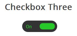
这个复选框的样式比样式二更复杂一些,它和前面的例子一样会左右滑动,并且当改变选中和未选中的状态时,滑块滑动到另一侧并且在原位置显示对应的文本。
首先,我们写HTML代码,这和前面是相同的。
<section> <!-- Checbox Three --> <h3>Checkbox Three</h3> <div class="checkboxThree"> <input type="checkbox" value="1" id="checkboxThreeInput" name="" /> <label for="checkboxThreeInput"></label> </div> </section> |
然后,我们用相同的方式把div作为滑块,下面的代码会创建一个黑色圆角的条带,我们可以把滑块和文本放到里面。
/** * Checkbox Three */ .checkboxThree { width: 120px; height: 40px; background: #333; margin: 20px 60px; border-radius: 50px; position: relative; } |
当滑块处于未选中状态时,滑块会在左侧,并且右边显示”OFF”,当点击的时候,滑块移动到右侧,左侧显示”ON”。
但是元素数量不足以让我们实现这些功能,所以我们要用:before和:after两个伪类创建两个元素,分别放置”ON”和”OFF”。
/** * Create the text for the On position */ .checkboxThree:before { content: 'On'; position: absolute; top: 12px; left: 13px; height: 2px; color: #26ca28; font-size: 16px; } /** * Create the label for the off position */ .checkboxThree:after { content: 'Off'; position: absolute; top: 12px; left: 84px; height: 2px; color: #ddd; font-size: 16px; } |
和前面一样,我们来添加滑块的样式,当被点击时它会移动到另一侧,并且改变颜色。
/** * Create the pill to click */ .checkboxThree label { display: block; width: 52px; height: 22px; border-radius: 50px; -webkit-transition: all .5s ease; -moz-transition: all .5s ease; -o-transition: all .5s ease; -ms-transition: all .5s ease; transition: all .5s ease; cursor: pointer; position: absolute; top: 9px; z-index: 1; left: 12px; background: #ddd; } /** * Create the checkbox event for the label */ .checkboxThree input[type=checkbox]:checked + label { left: 60px; background: #26ca28; } |
样式四
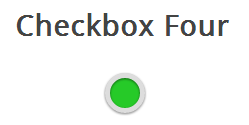
在这个样式中,我们会创建两个圆形,当点击时改变里面的圆形的颜色表示选中与未选中的状态。
和前面一样的HTML代码。
<section> <!-- Checbox Four --> <h3>Checkbox Four</h3> <div class="checkboxFour"> <input type="checkbox" value="1" id="checkboxFourInput" name="" /> <label for="checkboxFourInput"></label> </div> </section> |
接下来我们要为checkbox创建外面的圆形,使用CSS的border-radius属性,并且设置为100%就可以创建一个正圆形。
/** * Checkbox Four */ .checkboxFour { width: 40px; height: 40px; background: #ddd; margin: 20px 90px; border-radius: 100%; position: relative; -webkit-box-shadow: 0px 1px 3px rgba(0,0,0,0.5); -moz-box-shadow: 0px 1px 3px rgba(0,0,0,0.5); box-shadow: 0px 1px 3px rgba(0,0,0,0.5); } |
然后我们用label元素来创建一个小一点的圆形,它会根据checkbox状态来改变颜色。
/** * Create the checkbox button */ .checkboxFour label { display: block; width: 30px; height: 30px; border-radius: 100px; -webkit-transition: all .5s ease; -moz-transition: all .5s ease; -o-transition: all .5s ease; -ms-transition: all .5s ease; transition: all .5s ease; cursor: pointer; position: absolute; top: 5px; left: 5px; z-index: 1; background: #333; -webkit-box-shadow:inset 0px 1px 3px rgba(0,0,0,0.5); -moz-box-shadow:inset 0px 1px 3px rgba(0,0,0,0.5); box-shadow:inset 0px 1px 3px rgba(0,0,0,0.5); } |
当复选框被选中的时候,我们要改变内圈的背景颜色来表示选中状态。
/** * Create the checked state */ .checkboxFour input[type=checkbox]:checked + label { background: #26ca28; } |
样式五
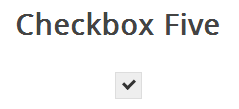
这个复选框的样式有些不同,它看起来只是比浏览器默认的checkbox样式稍微好了些,但是不同的是我们可以根据自己的需要来定义它的样式了。
首先还是一样的HTML代码
<section> <!-- Checbox Five --> <h3>Checkbox Five</h3> <div class="checkboxFive"> <input type="checkbox" value="1" id="checkboxFiveInput" name="" /> <label for="checkboxFiveInput"></label> </div> </section> |
在前面的例子中,我们把div作为checkbox的滑动条带或者外部的圆圈,但是这一次我们不需要了,可以使用div元素来设置复选框的区域。
/** * Checkbox Five */ .checkboxFive { width: 25px; margin: 20px 100px; position: relative; } |
label标签用于Click事件和我们要定义的复选框的方框样式。
/** * Create the box for the checkbox */ .checkboxFive label { cursor: pointer; position: absolute; width: 25px; height: 25px; top: 0; left: 0; background: #eee; border:1px solid #ddd; } |
接下来,我们要创建方框中的对勾,对于这一点,我们可以使用:after伪类创建一个新的元素,为了实现这个样式,我们可以创建一个5px x 9px的长方形并给他加上边框。这时候我们去掉上面和右边的边框之后,它会看起来像一个字母L。然后我们可以使用CSS的transform属性让它旋转一下,这样看起来就像是一个对勾。
/** * Display the tick inside the checkbox */ .checkboxFive label:after { opacity: 0.2; content: ''; position: absolute; width: 9px; height: 5px; background: transparent; top: 6px; left: 7px; border: 3px solid #333; border-top: none; border-right: none; -webkit-transform: rotate(-45deg); -moz-transform: rotate(-45deg); -o-transform: rotate(-45deg); -ms-transform: rotate(-45deg); transform: rotate(-45deg); } |
在上面的CSS中,我们已经设置它的透明度为0.2,所以你会看到的复选框有一个半透明的对勾。你可以在悬停的时候加深一点,在选中时,可以把设置为不透明。
/** * Create the hover event of the tick */ .checkboxFive label:hover::after { opacity: 0.5; } /** * Create the checkbox state for the tick */ .checkboxFive input[type=checkbox]:checked + label:after { opacity: 1; } |
这将会为你创建全新的checkbox复选框样式。
观看演示,看看这些复选框是如何工作的。
本文翻译自 How To Style A Checkbox With CSS
自定义select样式 Selectyze jquery plugin – Skin your own selects lists with jQuery & CSS
拓展阅读 CSS3 Checkbox Styles
超牛逼
checkboxFour input忘记写 display:none;了!
文字无法与复选框同行,怎么解决,求教!!
如何可以让这些按钮默认是选中状态呢 博主求告知下
直接在input中加checked就会默认选中了
东西蛮好用的,改了改,达到了想要的效果,但是公司任务要求兼容到IE8,本人初入门,想问下解决方案,是javascript还是单独编写IE8的 css样式,或者其他的什么解决方案,求教
这个样式只对第一个有效果,后面的都没有效果为什么。求帮助
我也是相同的问题,这种效果只能针对一个checkbox,但是checkbox一般都不止一个,怎样达到效果呢?求帮助
为什么复选框用了只有第一个可以点击,其他的点击都只对第一个起作用????
因为你没有改ID
id? 难道每个复制的都要一个新的ID吗
.unit-button {
float: left;
width: 21px;
height: 21px;
position: relative;
display: inline-block;
input[type=checkbox],
input[type=radio] {
// visibility: hidden;
opacity: 0.1;// 核心
}
label {
display: block;
width: 16px;
height: 16px;
-webkit-transition: all .5s ease;
-moz-transition: all .5s ease;
-o-transition: all .5s ease;
-ms-transition: all .5s ease;
transition: all .5s ease;
cursor: pointer;
position: absolute;
top: 5px;
left: 0;
z-index: -1; // 核心
background: url(../../img/commme/checkbox.png) no-repeat;
background-size: cover;
}
input[type=checkbox]:checked+label,
input[type=radio]:checked+label {
background: url(../../img/commme/checkbox_active.png) no-repeat;
background-size: cover;
}
}
这段代码可以实现你的,不过具体你要修改下,你的问题应该也是我遇到的,吧label设置z-index: -1;然后把控件设置成opacity,这样复选框 单选框都可以点击,不然单选框是有问题的!
这个会变回原来的样式啊
我改了还是这样 ,感觉好懵
很好用,但是ie7和ie8都用不了啊,如果这两个也能用就更好了
很有用,点个赞
很有用。谢谢
IE8不支持
谢谢博主了
(☆_☆)看着眼熟,果然是wordpress
无意中发现,以后会用到,谢谢分享
看了下,很有用,点个赞!
现在朽木开始搞学术了?哈哈
偶尔装一下老师感觉也不错的说
学习一下,看到博主好多php技术文章,以后要常来看看了,我现在的站也是用php架构的
博主的qq多少呢,有问题请教